After Salesforce’s new Lightning UI was introduced, feedback from our users showed that excessive white space was our #1 blocker to user adoption. Existing customers complained there was too much white space and the density of information was less than what they were used to in the “Classic”/previous Salesforce version. This resulted in users scrolling more, looking for information, resulting in loss of efficiency and productivity. Our goal was to provide an experience that was on par or better than “Classic” with minimal impact to development cycle and product teams.
My Role
As Principal UX lead, I led cross-cloud effort to provide a viable solution to executive stakeholders, drive alignment and commitment from various Product/UX/Engineering owners, and execute solution within a single release.
The Solution
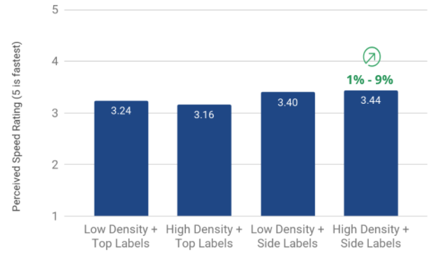
Provide users with a compact display mode that provided the same density of information as “Classic” that they could set as their default view to suit their need. What looked like a simple solution required diving deep into our technical structure, large coordination effort between various groups, and hyper attention to detail in order to be successful. This resulted in a 1 – 9% lift in perceived speed in productivity. White space was no longer a barrier to adoption for our existing user base, allowing Salesforce to reach its 17 million monthly active user base goal of FY21.
How it came together
Being new to Salesforce (3 months in at that time), I was given the opportunity to lead the Densification project. I wasn’t very familiar with the intricacies of Salesforce needed for this type of work, and didn’t have prior relationships to leverage. It was, however, a good way to quickly get to know the site and the people who built it.
One of the biggest challenges was getting consensus from various stakeholders on what densification meant in terms of change our users would see, what was the right amount, and how many options we would provide to our users. It was important as a first step to level set on what densification was and was not. Defining what we were comfortable with changing, the impact, and effort required was important since this was a project that would required resource commitment from various products across the organization. Through the use of our Global Design System, we settled on Space and Size as our two methods to best solve this problem.
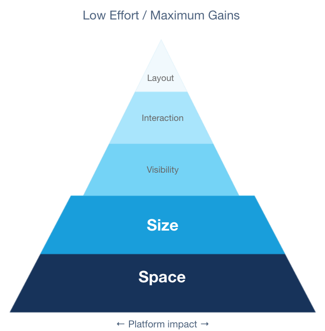
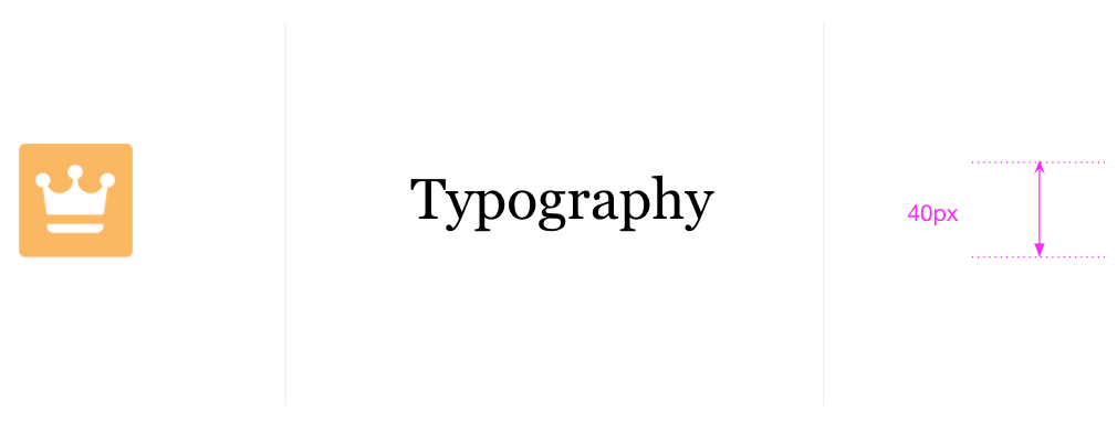
We would focus on Icons, Typography, and Spacing as our key drivers of change.
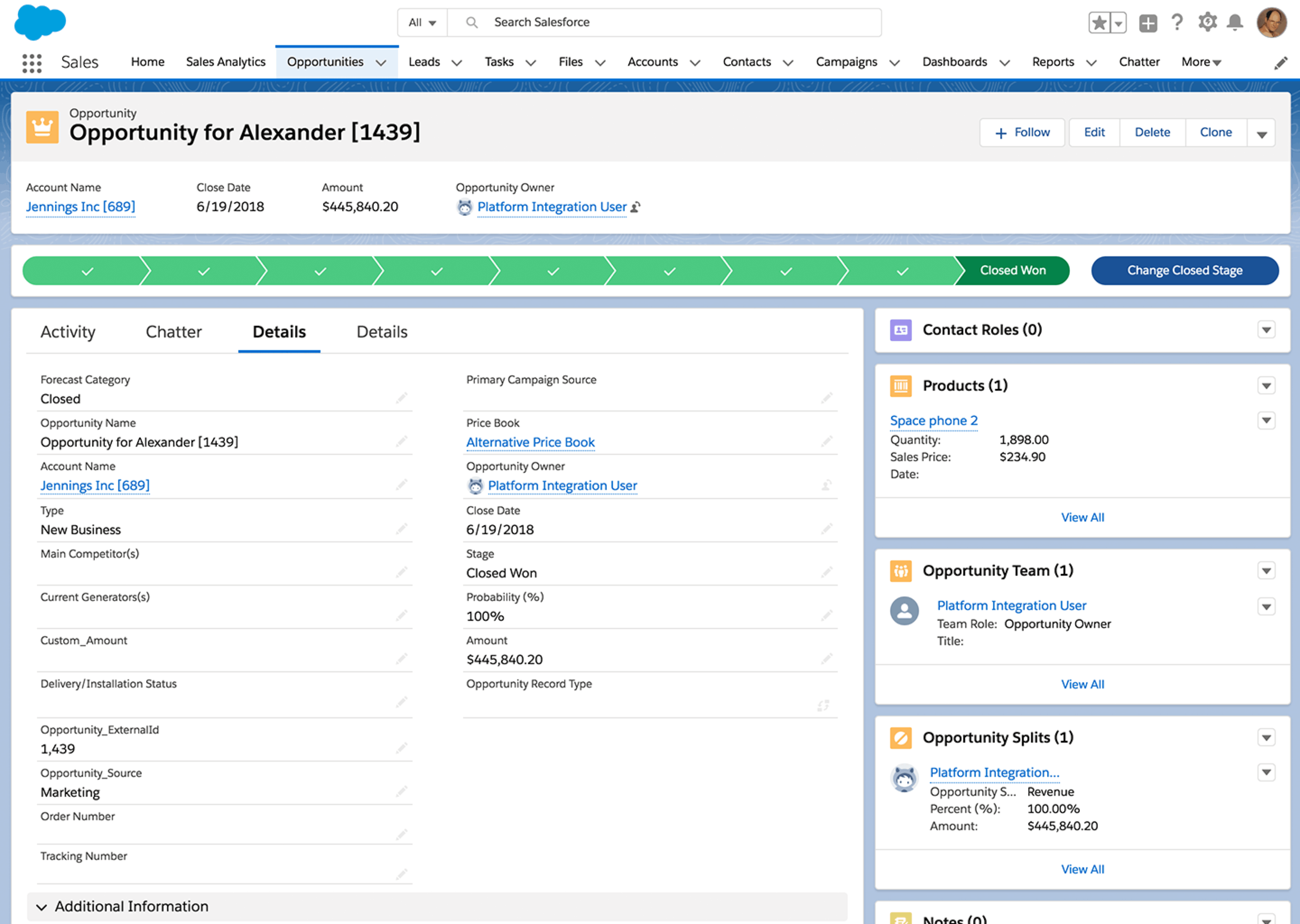
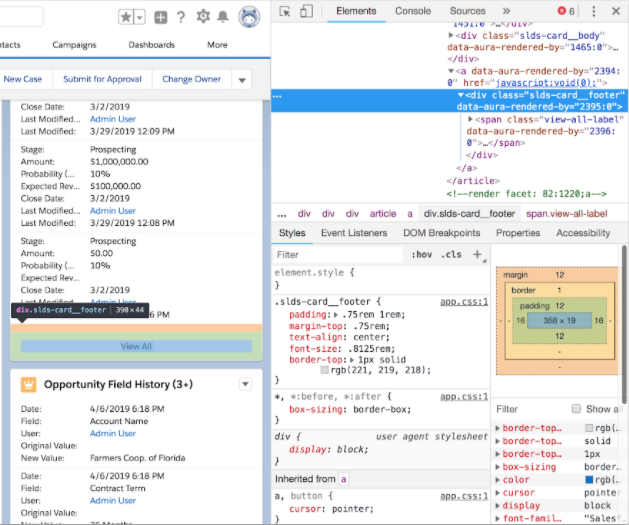
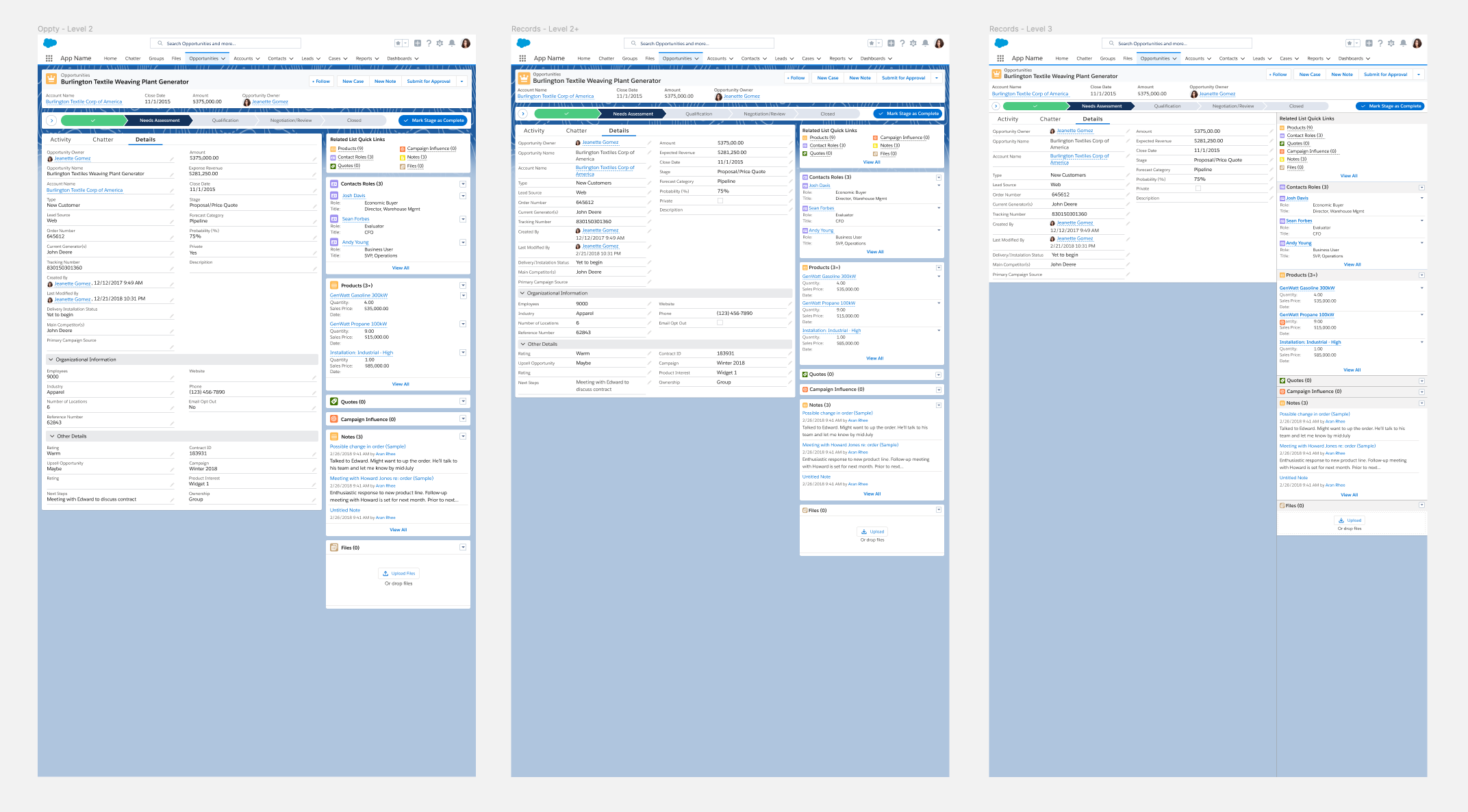
But it wouldn’t be as simple as it sounds. Even though we had a Design system in place, it was not always implemented correctly, consistently, or at all. This required deep diving into the code and connecting with product owners, designers and engineers to understand how each component was built (over 100 components across 5 key objects). We needed to recognize how making a global change to spacing and sizing would impact each component and how they interacted together on a page, ensuring every component combination would look as one design. This would lead to our third method; Design curation as needed.
Now that we had our methods in place and a good understanding of how these changes will impact our UI, it was time to dial in various combinations to see what worked best and get agreement from our stakeholders. Since this was a very time-sensitive project, we established a weekly sync with our key stakeholders and others who were going to be impacted by the change. The key here was for all of us to move along together in this high profile/high impact project.
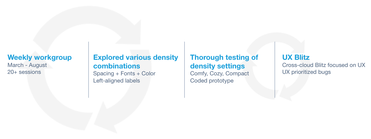
In these weekly syncs we would review numerous design iterations discussing what was too much, what could be pushed further, other areas we could explore…
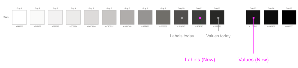
Such as color contrast of labels and data to help with scannability.
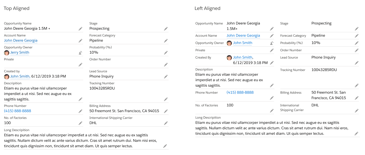
Field label alignment to help reduce vertical height.
But most importantly, we needed, as a group, to agree on what felt right. Our next step was to test various combinations to see which options provided the best experience and how many options we should offer to our users.
Implementing method 1 and 2 had its risks. We needed to ensure that such global changes didn’t have any negative impact to the site and to millions of our users. So, we enlisted the help of 30+ UX folks from across the organization to perform a visual QA on the site. It was important to establish a partnership with these folks because they knew their app the best and would be able to quickly identify if something was not right when our density setting was switched on. Building these relationship and trust was key to the success of this project.
We launched with “Compact” setting (Left-aligned labels and level 2 spacing and size alteration) within three months. We continued to monitor user feedback and internally tested a second variant. Since the launch of “Compact” view, we no longer received customer complaints of excessive white space, and user adoption of the Lightning UI has improved dramatically, which contributed to the company reaching our goal of 6 million monthly active users by FY21.
So what did I learn from all this?
Find out in my Medium article Designing at Enterprise Scale
 ux54
ux54 
You must be logged in to post a comment.